 In the recent past the Seahawks had rain-colored uniforms with
rain-colored numbers and rain-colored accents. This reflected the
weather patterns of the region but it made our players seem like they were trying to literally blend into the scenery.
In the recent past the Seahawks had rain-colored uniforms with
rain-colored numbers and rain-colored accents. This reflected the
weather patterns of the region but it made our players seem like they were trying to literally blend into the scenery.
Since Pete Carroll took over the blue has gotten darker, the
metallic pattern made the numbers look tougher and the bright green accents give the uniforms flair. Most Seattle fans probably agree that this is an improvement. This uniform still represents the region but gives the team an emphatic presence.

In the spirit of silliness, here are some observations about
the different logos and uniforms across the NFL.
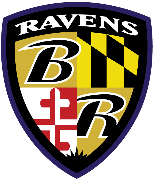
 Ravens strike fear into the hearts of poets as they ponder “weak and weary, Over many a quaint and curious volume of forgotten lore.”
However, the Baltimore Ravens’ logo is less than awe inspiring. A quirk of the
eye makes the raven look concerned. “It does not look like it’s ready to
fight,” said Michael Howard. Further, someone must have thought people might
not get the association and added a letter B to the raven. It is not a good
idea to put a letter on a logo that must reverse: the B has to turn the
opposite way on the other side of the helmet, which effectively makes it two
different logos.
Ravens strike fear into the hearts of poets as they ponder “weak and weary, Over many a quaint and curious volume of forgotten lore.”
However, the Baltimore Ravens’ logo is less than awe inspiring. A quirk of the
eye makes the raven look concerned. “It does not look like it’s ready to
fight,” said Michael Howard. Further, someone must have thought people might
not get the association and added a letter B to the raven. It is not a good
idea to put a letter on a logo that must reverse: the B has to turn the
opposite way on the other side of the helmet, which effectively makes it two
different logos. 
At least they decided to use the raven for the helmet. They
could have used the shield.
 The New York Giants also have letters on their helmets, but
because this is the only thing on the helmet-logo, they can reverse the big,
readable letters from one side to the other without the logo suffering a
change. New York made a good decision in staying with the letters of their
state or team name, which are more identifiable than trying to create a giant
(which would defeat its own purpose on the scale of a helmet). They are a
traditional team that doesn’t fuss with their uniforms so while there is a
craze for retro uniforms this year, I don’t know if the Giants would get much
out of switching them.
The New York Giants also have letters on their helmets, but
because this is the only thing on the helmet-logo, they can reverse the big,
readable letters from one side to the other without the logo suffering a
change. New York made a good decision in staying with the letters of their
state or team name, which are more identifiable than trying to create a giant
(which would defeat its own purpose on the scale of a helmet). They are a
traditional team that doesn’t fuss with their uniforms so while there is a
craze for retro uniforms this year, I don’t know if the Giants would get much
out of switching them. The Dallas Cowboys come from the Lone Star State. They went
with silver uniforms and a big bold star on their helmets. This logo is not artsy but Texas is more “wild
west” than “artsy” anyway. The star does exactly what it is supposed to do:
captures the spirit of the team for the fans and lets them know immediately which players in a scrimmage are theirs.
The Dallas Cowboys come from the Lone Star State. They went
with silver uniforms and a big bold star on their helmets. This logo is not artsy but Texas is more “wild
west” than “artsy” anyway. The star does exactly what it is supposed to do:
captures the spirit of the team for the fans and lets them know immediately which players in a scrimmage are theirs. The Pittsburgh Steelers have a good-looking logo. It is historic, bold
and unmistakable for that of any other team. It has the word “Steelers” on it,
which is not reversible within the image, but they made the good decision to only
have the logo on one side of the helmet rather than mess with the look of it.
The Pittsburgh Steelers have a good-looking logo. It is historic, bold
and unmistakable for that of any other team. It has the word “Steelers” on it,
which is not reversible within the image, but they made the good decision to only
have the logo on one side of the helmet rather than mess with the look of it. 
The Oakland Raiders are a tough, old-school football team and
their logo shows exactly that. This logo is such a busy mixture of things that
it ought to be a disaster: a crest, two crossed swords, and a guy wearing both
an eye-patch and an old-fashioned football helmet. As if that wasn't enough, it also has the word RAIDERS on it. However, it is so crazy that
it sails all the way around and becomes amazing.

 Perhaps the Miami Dolphins were trying for a similar theme
with their retro 2015 uniforms but unlike the Raiders they do not get to
amazing. Their dolphin is either jumping through a hoop or across the sun. For
some reason the dolphin is wearing a helmet which has an M on it because while
they didn’t feel the need to make the sun/hoop clear, the fact that this is
Miami needed to be established beyond all doubt. To be fair to the Dolphins, their modern logo does not wear a
helmet. The sun is a little clearer and there are no letters. This turns their
logo from “WTF” to “oh, it’s a dolphin.”
Perhaps the Miami Dolphins were trying for a similar theme
with their retro 2015 uniforms but unlike the Raiders they do not get to
amazing. Their dolphin is either jumping through a hoop or across the sun. For
some reason the dolphin is wearing a helmet which has an M on it because while
they didn’t feel the need to make the sun/hoop clear, the fact that this is
Miami needed to be established beyond all doubt. To be fair to the Dolphins, their modern logo does not wear a
helmet. The sun is a little clearer and there are no letters. This turns their
logo from “WTF” to “oh, it’s a dolphin.”
I will also say that no one else in the NFL wears turquoise
blue and orange.
The Cleveland Browns do not wear the “brownie elf,” opting
instead for plain orange helmets. This is wise.

 The Browns have perhaps widest aesthetic split in their
uniforms: the retro chocolate-brown uniforms might not be bright but they suit
the name, look old-fashioned in a gritty "play in rain or shine" way,
and are unique. The orange version is an unfortunate shade meant to be
different from the Bengals. However, the two are still similar enough to be
confusing in scrimmage and the Browns’ shade of red-orange somehow triggers afterimages on the television screen.
The Browns have perhaps widest aesthetic split in their
uniforms: the retro chocolate-brown uniforms might not be bright but they suit
the name, look old-fashioned in a gritty "play in rain or shine" way,
and are unique. The orange version is an unfortunate shade meant to be
different from the Bengals. However, the two are still similar enough to be
confusing in scrimmage and the Browns’ shade of red-orange somehow triggers afterimages on the television screen.
The Cincinnati Bengals’ helmets look great. The black tiger-stripes against the bright orange are striking. I must address the
elephant in the room, though. Their uniforms make the huddle look like Cone-henge.

Tigers are orange and black. Ravens are purplish-black. Stars
are silver. So what colors do you pick for rams? The St. Louis Rams said “to
hell with it” and chose blue and gold. Their helmets are the most simple and
effective in the league. Further, the gold ram-horn swirl makes the players
look like they are about to lower their heads and move the chains. Note how the shoulder accents echo the horns.

The Cowboys’ star and the Rams’ horns
are simple and effective. However, the Minnesota Vikings’ horns do not achieve the same effect.

Why not? It’s hard to say. The star and swirl are simple 2D renderings but if anything the Vikings went too simple with their big white curve. It’s difficult sometimes to tell what
the horns are. Is it a Joker smile? Venom eyes? For all their simplicity, the Viking horns are not as readily apparent as other logos.


The Washington Redskins logo is meant to be a stereotypical
Native American. Dan Snyder resists changing it because of “tradition” but it
isn’t even a great logo. Aesthetically, it has a lot of fussy details that blur
into a dark blob from further away than about ten yards. If someone
didn’t already know what the logo was supposed to be, they probably would not
be able to tell from the stands.
 The Denver Broncos made excellent use of abstract rendering with their logo. The Bronco is immediately identifiable. It looks fierce and fast, and discourages people from wanting to mess with it. Can't say I'm a fan of the orange jerseys but that color does look cool in the mane of the logo.
No comments:
Post a Comment